One key area that all ecommerce businesses can focus on to increase their sales is the user’s experience when landing on their product pages. These pages are often the first place that potential customers land on your site and interact with your product, so it’s important to make sure that they have the “right” experience. But what does that mean?
Naturally, the team at Arqspin spends a lot of time thinking about online product experiences. This idea was at the core of the development of our 360° spin product, but the experience goes beyond the product photography (although it’s important!). This is a list of great examples of ecommerce product pages, with some insight into why these pages really work when it comes to selling products.
One note before we begin: even though we think these ideas are great, it is imperative that you constantly test and optimize your own product pages. You won’t know how your unique audience interacts with your product and website until you test it!
Here are five examples of great product landing page inspiration:
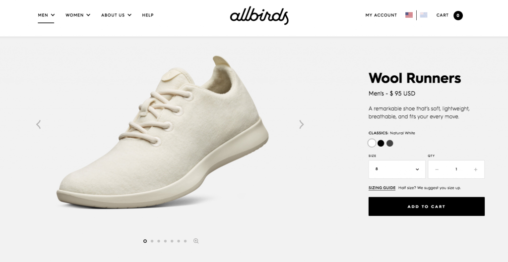
Allbirds – Wool Runners
Allbirds has a great brand overall, but their product pages in particular are a really good example of an easy to digest, product-focused landing page. It displays all the information you need beautifully above the fold, complete with size/color choices and order button, providing a complete picture at a glance. But then it goes further, allowing the thorough buyer to dig in more deeply with concise, clearly displayed value presentations. It also helps that the design is simple and bold, and the photography is top-notch.
The product photography itself is great, with a multi-angle carousel right at the top, and a good product breakdown halfway down the page. The lifestyle photography is fashionable and “hip,” showing customers how cool they will look (and feel!) in the shoes. It’s also worth noting the clear, well designed “benefits” icons that make the value props clear and easy to understand.
Soylent – Drink
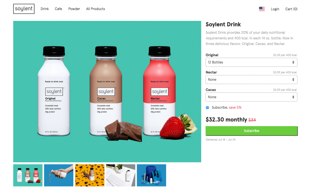
Soylent presents another great example of how to apply the “inverted pyramid” information hierarchy to a product page. They include the most important messaging above-the-fold, showing users the core message immediately upon seeing the page. Then they allow you to dig down through the more detailed information at your leisure.
This product photo carousel stays away from the intentional multi-angle approach that Allbirds uses, instead opting for bright, high-energy “brand shots” that focus on making Soylent look cool and fun. The rest of the pages content is very concise and bold, laying out only the most important information. One interesting detail is the nutrition information diagram, which takes a complex subject matter and makes it easy to read and absorb.
Üllo – Üllo + Decanter
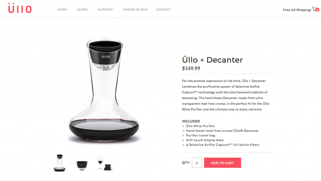
This third entry, for Üllo’s cool purifying wine decanter, shows a subtler, more refined approach to a product landing page. The colors are more muted (aside from the red spot color) and the design is cleaner, stepping back to allow the subtle, transparent decanter to stand out on the page.
The product photography is good, but it is a little hard to experience with its separate “galleries” for product and lifestyle shots. On the plus side, they do a great job of highlighting the artisanal origin of these pieces with the process photos. Users who are researching your product want to see how and why you create products, if you’ve got a good story make sure to tell it!
Nomatic – Travel Bag
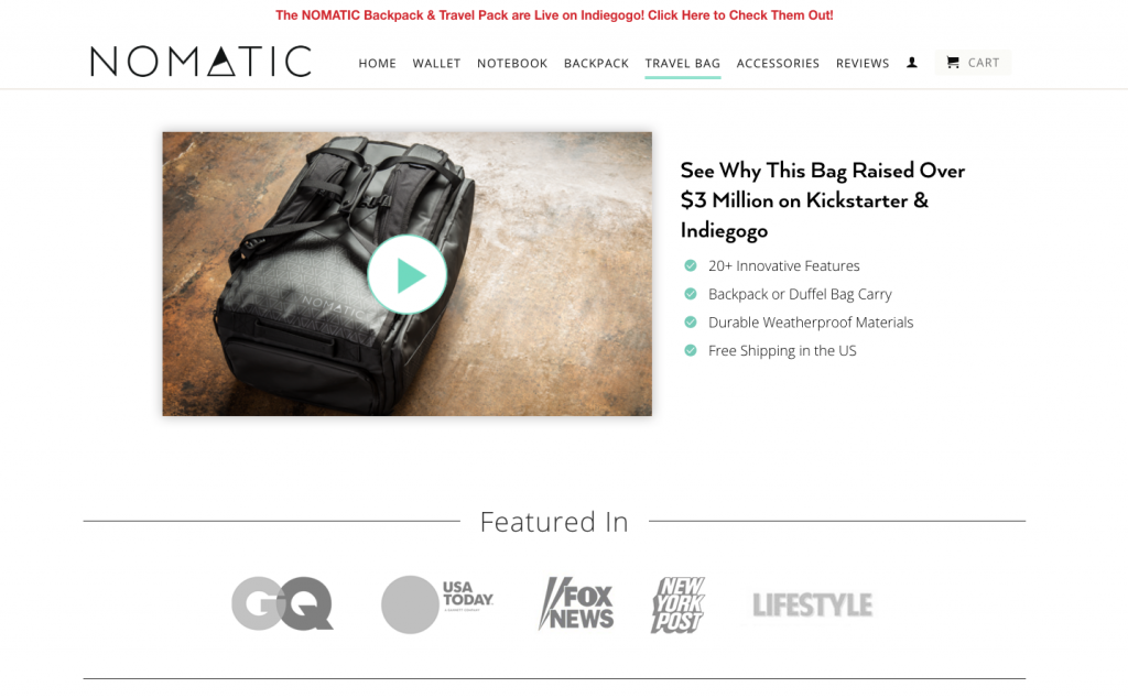
Nomatic uses a highly visual landing page design, with a well produced video at the top of the page instead of the usual product photos, then an immediate follow up with an image showing the value prop – “The most functional travel bag ever!” This engages the visitor immediately in the brand story. We’d recommend against putting the purchase point midway down the page, however, as some buyers will already know that they want to purchase. We recommend showing a buying call to action immediately, clearly displayed above the fold.
This is particular product is not focused on its looks, but it’s functionality. This landing page does a great job of tackling the difficult question – how to show a product’s value and function, instead of tell it. This is a problem that many utilitarian products stumble on with their landing pages, but Nomatic solves it gracefully.
Conscious Step – Socks That Protect Oceans
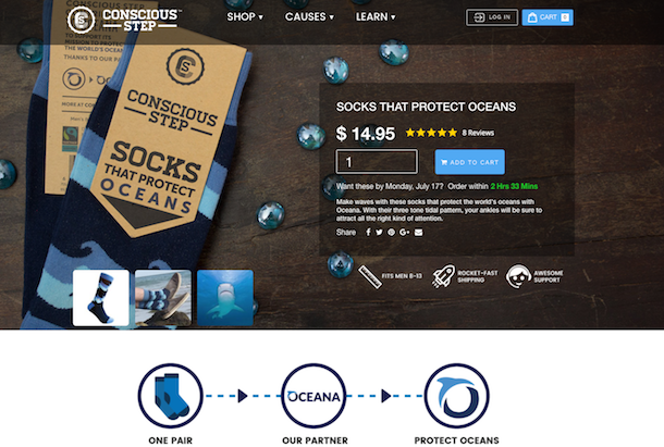
Conscious Step shows what can be done with a short, basic product page that highlights their brand and gets the job done. It’s combination of bold, simple design and clean photography shows the user all they need to see quickly and easily. They communicate their mission of making the world a better place, their unique approach, as well as the quality and design of their product, all in less than 200 words and with clean looking icons. Rather than giving users a mountain of information to sift through, they can instead focus on converting.
The page is very heavily focused on product photography of Conscious Step’s fashionable socks, with big bold photos and even an awesome Arqspin 360° spin! That, plus the good lifestyle photography makes for a great user experience.
That’s all the product landing page inspiration we have for you! If you want to talk about making better product landing pages or using Arqspin 360° product photography on your site, give us a call or hit our contact form.